Ever found yourself staring at a sea of data, wishing there was an easy way to turn it into a chart? I certainly have. A recent project of mine involved sifting through mountains of data, and luckily, I discovered InstaCharts, which turned that overwhelming experience into a breeze. With just a few clicks, I was able to create dynamic, engaging visuals, and it felt almost magical!
Unleashing the Power of InstaCharts
Have you ever felt overwhelmed by data visualization? I know I have. The thought of creating charts and graphs can be daunting, especially if you’re not a tech wizard. But that’s where InstaCharts comes in. This tool is a game changer for anyone intimidated by data. With its user-friendly interface, even non-techies can create stunning visuals in no time.
User-Friendly Interface
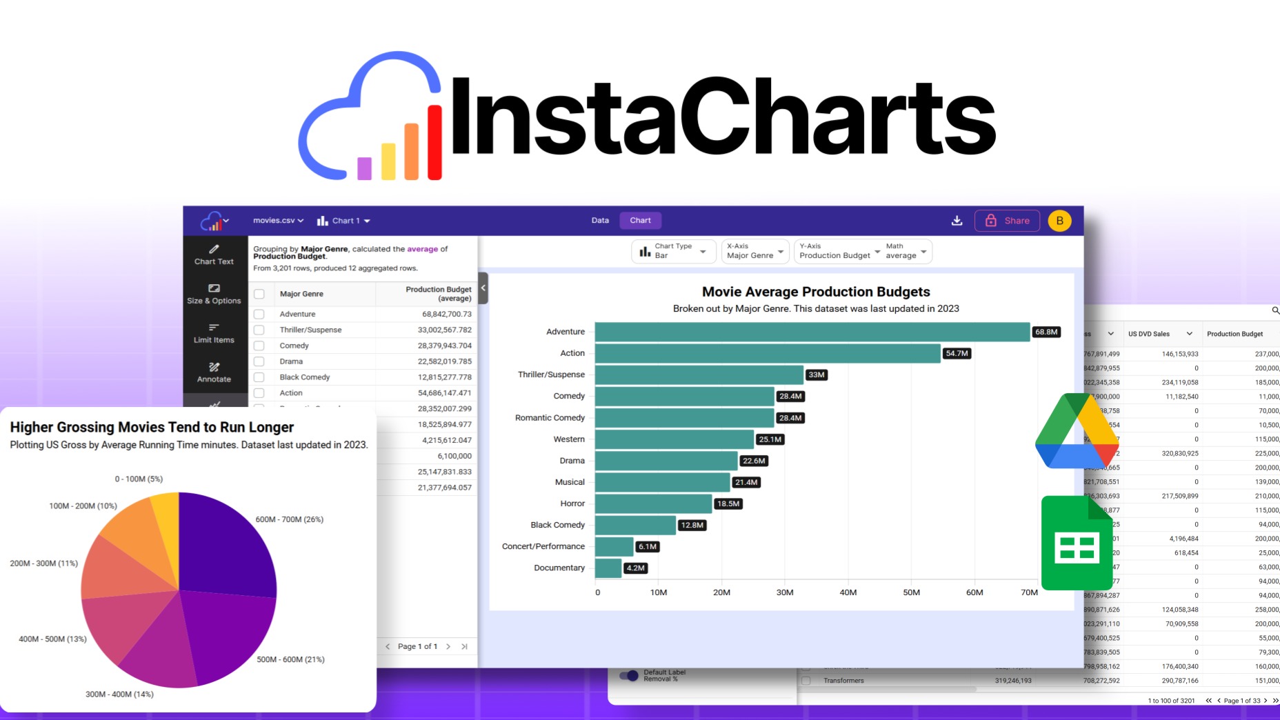
One of the first things I noticed about InstaCharts is how easy it is to use. You don’t need to be a data scientist to navigate through its features. Just upload your data file, and voila! InstaCharts automatically generates a chart tailored to your data. It’s that simple.
- Empowers Non-Techies: The intuitive design allows anyone to create beautiful charts.
- Fast and Efficient: You can generate visuals quickly, saving you time and effort.
Imagine being able to present your data without the usual headaches. With InstaCharts, that’s a reality. It’s like having a personal assistant who knows exactly how to make your data shine.
Supports Various File Formats
Flexibility is key when it comes to data visualization. InstaCharts supports several file formats, including:
- .csv
- .xlsx
- .json
This means you can easily import your data from spreadsheets or other sources. No need to worry about compatibility issues. Just upload your file and start creating.
Chart Variety
What I love about InstaCharts is the variety of chart types available. You can choose from ten different options, including:
- Line charts
- Bar charts
- Pie charts
- Scatterplots
This range ensures that you can find the perfect visual representation for your data. Whether you’re preparing a report for work or sharing insights with clients, InstaCharts has you covered.
“InstaCharts has simplified the way I present data, making it not just easy but fun!” – Bart Howe
Rapid Creation and Sharing
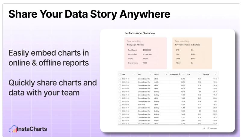
InstaCharts allows users to create, share, and embed charts rapidly. This is particularly beneficial for professionals in consulting, freelancing, and marketing. You can easily embed charts on your website or blog with just a simple copy and paste of the embed code. This feature enhances user engagement and keeps your audience updated with the latest data insights.
Continuous Improvement
What’s more, InstaCharts is constantly evolving. The developers actively seek user feedback and implement improvements. Recently, they added features like data labels on charts and transformations, which shows their commitment to enhancing user experience.
With a rating of 4.8, it’s clear that users appreciate the tool’s capabilities. Many have noted how it significantly aids their productivity in presenting information effectively.
Conclusion
InstaCharts is not just another data visualization tool; it’s a powerful ally for anyone looking to present data in a clear and engaging way. If you’re tired of struggling with complex software and want something that works seamlessly, I highly recommend giving InstaCharts a try. It has transformed how I approach data representation, and I believe it can do the same for you.
For more information and to get started, check out the InstaCharts Review: Create Beautiful Charts & Graphs Based on Data | AppSumo Lifetime Deal.
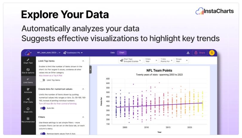
The Dynamic Charting Experience
Have you ever struggled to keep your audience’s attention during a presentation? I know I have. That’s where interactive charts come into play. They engage viewers and significantly boost data retention. When I started using interactive charts, I noticed a remarkable difference in how my audience reacted. They were not just looking; they were engaging. This kind of interaction is crucial in today’s fast-paced world.
Why Choose Interactive Charts?
Interactive charts are more than just pretty visuals. They allow users to explore data in real-time. This means that instead of passively receiving information, your audience can click, hover, and dig deeper into the data presented. It’s like giving them a treasure map instead of just telling them where the treasure is buried. Wouldn’t you rather have your audience actively involved?
- Engagement: Interactive charts keep viewers interested.
- Retention: Users remember information better when they can interact with it.
According to reports, utilizing interactive features can elevate engagement in digital presentations. I’ve seen this firsthand. When I incorporated dynamic charts into my reports, feedback was overwhelmingly positive. People were asking questions and wanting to know more. It felt like a conversation rather than a lecture.
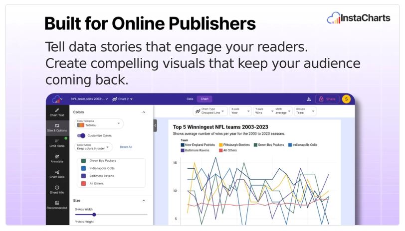
Easy Integration with Platforms
Another fantastic aspect of interactive charts is their simple embed codes. Integrating these charts into platforms like WordPress is a breeze. I remember the first time I embedded a chart using a simple copy and paste. It took less than five minutes! This ease of use is a game-changer for those of us who want to present data without diving into complex coding.
Imagine being able to share your insights effortlessly. With tools like InstaCharts, you can create beautiful charts and graphs based on your data. The process is incredibly straightforward. You just upload your data file, and InstaCharts does the rest. It’s efficient and user-friendly, making it a great asset for anyone looking to unlock useful insights.
Real-Time Data Updates
One feature I particularly appreciate is the ability to keep data fresh through integration with Google Sheets and Google Drive. I can automate updates by setting a sync schedule—whether it’s hourly, daily, or monthly. This means my charts are always up-to-date, which is essential for accurate reporting.
“Interactivity in charts keeps my audience engaged on every project!”
This quote resonates with my experience. The interactivity of charts not only enhances engagement but also ensures that my team stays informed. I can share data insights through interactive tables, making it easier for everyone to grasp complex information.
Continuous Improvement and User Feedback
What’s more, InstaCharts is constantly evolving. User feedback is taken seriously, and recent updates reflect a commitment to enhancing the user experience. Features like data labels on charts and transformations have been rolled out, making the tool even more versatile. I appreciate that the founder, Bart Howe, maintains direct communication with users. It feels good to know that my suggestions are valued.
InstaCharts has received rave reviews, with an overall rating of 4.8. Users love its rapid chart creation and seamless workflow. It’s a tool that truly makes data visualization easy and fast. If you’re looking for a way to present information effectively, I can confidently recommend giving InstaCharts a try. It has transformed how I approach data representations, and I believe it can do the same for you.
So, are you ready to elevate your presentations? With interactive charts, you can engage your audience like never before. Don’t miss out on the opportunity to make your data come alive!
Keeping Data Fresh: Sync and Automate
In today’s fast-paced world, keeping data up-to-date is crucial. I’ve discovered that automated syncing with Google Sheets can save hours of manual updates. Imagine not having to spend your valuable time entering data over and over again. Sounds appealing, right? With the right tools, you can achieve this.
Why Automated Syncing Matters
Automated syncing is a game changer. It allows you to set up a connection between your data sources and your charts. This means that whenever your data changes, your charts update automatically. No more manual interventions! This feature is particularly useful for busy professionals like us, who need to present accurate information without the hassle of constant updates.
- Save Time: Automated syncing with Google Sheets saves hours of manual updates.
- Flexible Schedules: You can tailor updates to your needs with flexible sync schedules—hourly, daily, or monthly.
Integration with Google Drive
One of the best parts about using InstaCharts is its integration with Google Drive. This ensures that you’re always dealing with the latest data. You don’t have to worry about outdated information slipping through the cracks. It’s like having a personal assistant who keeps everything organized for you.
When I first started using InstaCharts, I was amazed at how easy it was to connect my Google Sheets. The setup took just a few minutes. I could focus on analyzing my data instead of worrying about whether my charts were accurate. This integration truly enhances productivity.
Pricing Plans That Fit Your Needs
InstaCharts offers pricing plans that make it easy to choose based on your usage. Here’s a quick overview:
- Solo Plan: $29 for 1,000 views per month.
- Pro Plan: $58 for 100,000 views per month.
These plans are reasonable, especially considering the potential for extensive chart views. Plus, with a 60-day money-back guarantee, you can try it out without any risk. I found this to be a smart investment for anyone serious about data visualization.
Real User Experience
Feedback from users has been overwhelmingly positive. Many have echoed my sentiments, stating,
“The automation features have taken my productivity to the next level!”
It’s clear that InstaCharts is making a significant impact on how we handle data.
With syncing capabilities, InstaCharts ensures that your charts reflect the most recent data without manual interventions. This is particularly beneficial for teams that need to stay updated on key metrics. I can share insights with my colleagues in real-time, which is invaluable for decision-making.
Conclusion
InstaCharts has transformed the way I approach data visualization. The combination of automated syncing, flexible schedules, and seamless integration with Google Drive makes it a powerful tool. If you’re looking to streamline your workflow and enhance your productivity, I highly recommend giving InstaCharts a try. You can check it out through my affiliate link: InstaCharts Review: Create Beautiful Charts & Graphs Based on Data.
Why InstaCharts Is Worth a Try
When it comes to data visualization, finding the right tool can be a challenge. I recently stumbled upon InstaCharts, and I must say, it’s been a game changer for me. This platform is designed to help users create beautiful charts and graphs effortlessly. But what makes InstaCharts truly stand out? Let’s dive into the reasons why I believe it’s worth a try.
Continuous Improvements Based on User Feedback
One of the first things I noticed about InstaCharts is its commitment to quality. The team behind it actively seeks user feedback to improve the platform. This is not just a marketing gimmick; it’s a genuine effort to enhance user experience. For instance, I’ve seen recent updates that introduced features like data labels on charts and various transformations. These enhancements reflect a dedication to making the tool even more user-friendly.
Have you ever used a tool that seemed stagnant? It’s frustrating, right? With InstaCharts, I feel like I’m part of a community that’s constantly evolving. The direct communication with the founder, Bart Howe, fosters a sense of belonging. Users can share their thoughts and suggestions, knowing they’re heard. This level of engagement is rare in many tech products today.
Affordable Pricing with a 60-Day Money-Back Guarantee
Now, let’s talk about pricing. InstaCharts offers two plans that are incredibly affordable. The Solo Plan is just $29 for a one-time purchase, which is a steal compared to the original price of $120. It allows for 1,000 views per month. If you need more, the Pro Plan is available for $58, down from $240, and it supports up to 100,000 views per month. This pricing structure is not only budget-friendly but also offers great value for the features provided.
And here’s the kicker: both plans come with a 60-day money-back guarantee. This means you can try out InstaCharts risk-free. If it doesn’t meet your expectations, you can get your money back. That’s a win-win situation!
User Reviews Highlight Ease of Use and Effectiveness
What do real users think? The reviews I’ve come across consistently highlight the ease of use and effectiveness of InstaCharts. Many users, including myself, appreciate how intuitive the platform is. I simply uploaded my data file, and InstaCharts generated a chart tailored to my needs. It’s that simple!
“The support from the InstaCharts team makes all the difference!”
This quote resonates with many users. The support team is responsive and helpful, ensuring that any questions or issues are addressed promptly. This level of service is crucial, especially when you’re working on tight deadlines.
InstaCharts: A Reliable Choice for Data Visualization
InstaCharts continually evolves, taking user feedback to improve features. This makes it a reliable choice for anyone needing data visualization tools. Whether you’re a consultant, freelancer, or marketer, this platform can help you unlock useful insights without requiring extensive technical know-how.
In conclusion, if you’re looking for a tool that simplifies data visualization while providing excellent support and continuous improvements, I confidently recommend giving InstaCharts a try. It has streamlined my workflow and significantly improved my ability to convey information through visual data. With its affordable pricing and a risk-free trial, there’s no reason not to explore what InstaCharts has to offer. You might just find it transforms your approach to data representation as it did for me.
TL;DR: InstaCharts is a powerful tool for creating and embedding charts from various data sources, perfect for professionals seeking efficient data visualization solutions.