As a content creator who often grapples with turning complex data into engaging visuals, I was thrilled to stumble upon ChartBrick—an all-in-one chart creation tool. Its promise of simplicity and flexibility made me curious, and I couldn’t resist giving it a whirl. In this post, I’ll dive into my experiences with ChartBrick, and why it might just be the solution you’ve been searching for, especially if you’ve ever fought with charting tools that feel more like a burden.
Picture this: you’ve got a mountain of data, yet the prospect of creating clean, readable charts feels overwhelming. That’s where ChartBrick comes in, and trust me, it’s been a game changer!
Table of Contents
ToggleWhat Makes ChartBrick Stand Out?
When it comes to data visualization, finding the right tool can feel overwhelming. But let me tell you about ChartBrick. It’s a game changer. This platform has quickly become my go-to for creating charts. Why? Let’s dive into what makes ChartBrick stand out.
1. Versatile Chart Types for Diverse Needs
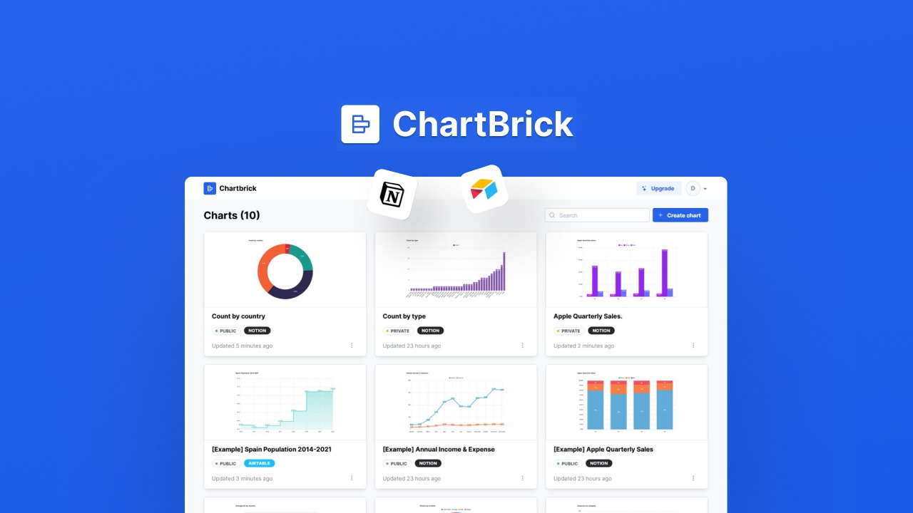
ChartBrick offers an impressive selection of eight different chart types. Whether you need a bar chart, line chart, pie chart, or something more specialized like a funnel or radar chart, you’ll find it here. This versatility means you can visualize your data in a way that best suits your needs.
- Column Charts
- Bar Charts
- Line Charts
- Area Charts
- Pie Charts
- Donut Charts
- Funnel Charts
- Radar Charts
Imagine you’re a freelancer presenting project data. Wouldn’t it be great to choose the chart that tells your story best? With ChartBrick, you can do just that.
2. User-Friendly No-Code Interface
One of the standout features of ChartBrick is its no-code interface. I’m not a tech wizard, and I bet many of you aren’t either. This platform makes it easy for anyone to create stunning charts without writing a single line of code. Just a few clicks, and voilà! Your chart is ready.
It’s perfect for content creators and freelancers who need to present data quickly. You don’t want to waste time learning complicated software. Instead, you want to focus on your work. ChartBrick allows you to do just that.
3. Lifetime Deal with Unlimited Charts
Now, let’s talk about the deal. For just $49, you get lifetime access to ChartBrick. Yes, you heard that right! Unlimited charts, no hidden fees. This is a steal compared to other platforms that charge monthly subscriptions.
Plus, there’s a 60-day money-back guarantee. This means you can try it out without any risk. If it’s not for you, just get your money back. How many tools offer that kind of assurance?
“Data visualization should never be a chore. ChartBrick makes it a breeze!” – Daniel, Founder of ChartBrick
4. Seamless Integration with Various Data Sources
ChartBrick connects effortlessly with popular data sources like Notion, Airtable, and MySQL. This means you can pull data from where you already work. No need to export and import files. Just connect and create. It’s that simple.
As someone who often juggles multiple platforms, this feature is invaluable. It saves me time and keeps my workflow smooth.
5. Focus on Ease of Use and Efficiency
ChartBrick is designed with the user in mind. The interface is clean and intuitive. You won’t find yourself lost in a maze of options. Instead, everything is laid out clearly. This focus on ease of use allows you to create charts quickly and efficiently.
In today’s fast-paced world, efficiency is key. Why spend hours on something that should take minutes? ChartBrick empowers you to work smarter, not harder.
6. A Community-Focused Approach
Daniel, the founder, is transparent about the platform’s development. He encourages user feedback and shares a roadmap for upcoming features. This kind of communication builds trust. It makes me feel like I’m part of a community that values my input.
In summary, ChartBrick is a powerful tool for anyone looking to visualize data without the hassle. With its versatile chart types, user-friendly interface, and unbeatable lifetime deal, it’s hard to find a reason not to try it out. If you’re interested in elevating your data presentation game, check out ChartBrick here.
Reflecting on Ease of Use and Functionality
When it comes to data visualization, I often find myself in need of tools that are not only effective but also easy to use. That’s where ChartBrick shines. One of the standout features for me is the real-time data generation. It’s a lifesaver! Imagine being able to update your graphs instantly without any hassle. This capability is invaluable for anyone who needs to represent current data, whether for a presentation or just to keep track of ongoing projects.
Real-Time Data Generation
With ChartBrick, I can update my graphs in real time without missing a beat! This user review perfectly captures my experience. The ability to see changes reflected immediately allows me to make informed decisions quickly. It’s like having a live feed of my data right at my fingertips. For those of us who work with fluctuating data, this feature is essential.
Download Charts for Presentations
Another fantastic aspect is the option to download charts as images. This feature adds a layer of flexibility that I truly appreciate. Whether I’m preparing for a meeting or creating a report, having the ability to download my charts means I can easily integrate them into my presentations. It saves time and ensures that I can present my data in a polished manner. No more awkward screenshots or formatting issues!
Embedding Capabilities Enhance Engagement
ChartBrick also offers impressive embedding capabilities. This means I can seamlessly integrate my charts into various platforms, like Notion or my own website. It enhances engagement by allowing viewers to interact with the data directly. I love how this feature encourages creativity with data representation. It’s not just about showing numbers; it’s about telling a story with visuals.
Ideal for Quick, Up-to-Date Visuals
For anyone needing quick, up-to-date visuals, ChartBrick is ideal. The platform’s no-code approach ensures that even those with minimal technical skills can create beautiful charts effortlessly. This aspect has been crucial for me, allowing my projects to shine without a steep learning curve. I can focus on the data rather than getting bogged down in complicated software.
Encouraging Creativity with Data Representation
Moreover, the variety of chart types available—like column, bar, line, and pie charts—opens up a myriad of visualization possibilities. I find myself experimenting with different styles, which keeps my presentations fresh and engaging. The platform truly encourages creativity, allowing users to represent their data in ways that resonate with their audience.
“With ChartBrick, I can update my graphs in real time without missing a beat!” – User Review
In conclusion, ChartBrick has transformed how I approach data visualization. The combination of real-time updates, download options, and embedding capabilities makes it a powerful tool for anyone looking to enhance their data presentation. If you’re on the lookout for a user-friendly chart creation tool, I highly recommend checking out ChartBrick. You can find the lifetime deal for just $49 on AppSumo, which is a steal considering the value it brings. Explore more about it here.
Navigating ChartBrick’s Limitations
While there’s a lot to love about ChartBrick, I’ve come across feedback regarding its limitations. These concerns are particularly relevant for potential buyers. Let’s break down some of the key issues users have reported.
1. Concerns Over Google Sheets Integration
One of the most significant drawbacks I’ve noticed is the lack of integration with Google Sheets. Many users, including myself, were hoping for this feature. After all, Google Sheets is a widely used tool for data management. It’s surprising that a chart creation tool like ChartBrick doesn’t support it yet.
In fact, 42% of users cited this lack of integration as a major drawback. That’s a substantial number! It makes you wonder: how many potential users are being turned away because of this? As one user put it,
“The features are great, but I do wish they’d integrate with Google Sheets soon!”
This sentiment resonates with many who rely on Google Sheets for their data.
2. Customer Support Challenges
Another area of concern is customer support. Some users have reported challenges when trying to get help with account limitations or features that weren’t functioning as promised. It’s frustrating when you encounter issues, and the support team isn’t responsive. I’ve been there, and it can overshadow the positive aspects of a tool.
When I first started using ChartBrick, I had a few questions. Thankfully, I didn’t run into any major issues. But I can understand the anxiety of those who did. The expectation is that a tool with such potential should also offer robust support. After all, we want to feel confident that help is available when we need it.
3. Lack of Stacking Deals
Lastly, the inability to stack deals might hinder some buyers. ChartBrick offers a one-time payment of $49 for a lifetime deal, which sounds great. However, the lack of stacking options means that if you want to expand your capabilities later, you might be out of luck. This limitation can feel restrictive, especially for users looking to grow their charting needs over time.
Transparency is Key
One thing I appreciate is the transparency regarding the development roadmap. Users expect more flexibility with purchases. Knowing what features are coming can help ease concerns. It’s reassuring to see that the founder, Daniel, has shared a roadmap and a changelog. This kind of communication is vital for building trust.
As I continue to explore ChartBrick, I can’t help but think about these limitations. The platform has so much potential, but addressing these concerns could make it even better. If you’re considering ChartBrick, it’s worth weighing these factors against its many strengths.
In summary, while ChartBrick is a powerful tool for creating charts, it’s essential to be aware of its limitations. The lack of Google Sheets integration, customer support challenges, and the inability to stack deals are significant points to consider. However, with ongoing development and user feedback, there’s hope for improvement in the future.
Is ChartBrick Right for You?
When it comes to data visualization, the right tool can make all the difference. I’ve been exploring ChartBrick, and I want to share my thoughts on whether it might be the right fit for you. Let’s dive into some key considerations.
Assessing Your Data Visualization Needs
First, think about your specific needs. What kind of data do you work with? How often do you need to create charts? If you’re like me, you might find yourself needing to visualize data frequently. ChartBrick supports various data sources like Notion, Airtable, and even CSV files. This versatility is a huge plus!
Imagine being able to create a stunning pie chart from your sales data in just a few clicks. That’s the kind of efficiency I appreciate. But, if your data visualization needs are minimal, you might not need a tool like ChartBrick. It’s essential to assess your requirements before making a decision.
Balancing Price Versus Features
Next, let’s talk about cost. ChartBrick offers a one-time payment of $49 for lifetime access. This is a great deal compared to many subscription-based services. However, it’s crucial to weigh the price against the features offered. With ChartBrick, you get unlimited charts and chart embeds, which can save you time and effort.
But is it worth it? Consider how much time you spend creating charts. If you find yourself wasting hours on other platforms, investing in ChartBrick might be a smart move. As an industry expert once said,
“Investing in tools that simplify my workflow is always worth it!”
This resonates with me, especially when I think about the time I save using ChartBrick.
Considering Future Updates and Support
Another important factor is the future of the tool. ChartBrick promises regular updates and improvements. This is reassuring, especially since I want to ensure my investment continues to provide value. The founder, Daniel, has been transparent about the platform’s roadmap, which is a good sign. Knowing that there are plans for enhancements gives me confidence in the longevity of the tool.
However, I’ve also seen some concerns from users regarding customer support. Some have reported issues with account limitations or features not working as expected. This can be frustrating, especially if you rely on the tool for your work. It’s something to keep in mind as you consider your options.
Weighing the Pros and Cons
In my experience, weighing the pros and cons is essential before buying any tool. ChartBrick has a lot to offer, but it’s not without its drawbacks. Individual needs will dictate if ChartBrick is a fit for you. If you’re committed to data visibility and need a user-friendly solution, it could be a fantastic addition to your toolkit.
On the other hand, if you’re looking for specific integrations, like Google Sheets, you might find yourself waiting. Users have expressed disappointment over the lack of this feature, which is slated for future updates. This uncertainty can be a dealbreaker for some.
Final Thoughts
Ultimately, the decision to invest in ChartBrick should align with your frequency of data usage and desire for ease of access. If you’re someone who values a no-code approach and needs to create charts quickly, ChartBrick could be the right choice for you. I’ve found it to be an excellent tool for visualizing data without the hassle.
In conclusion, if you’re considering a user-friendly chart creation tool with promising potential, ChartBrick is certainly worth exploring. You can check it out through my affiliate link: ChartBrick Lifetime Deal. Happy charting!
TL;DR: ChartBrick offers an impressive lifetime deal for creating dynamic charts without complicated coding. Its user-friendly interface and real-time data capabilities set it apart, making it an excellent choice for creatives seeking to elevate their data presentation.